What this means
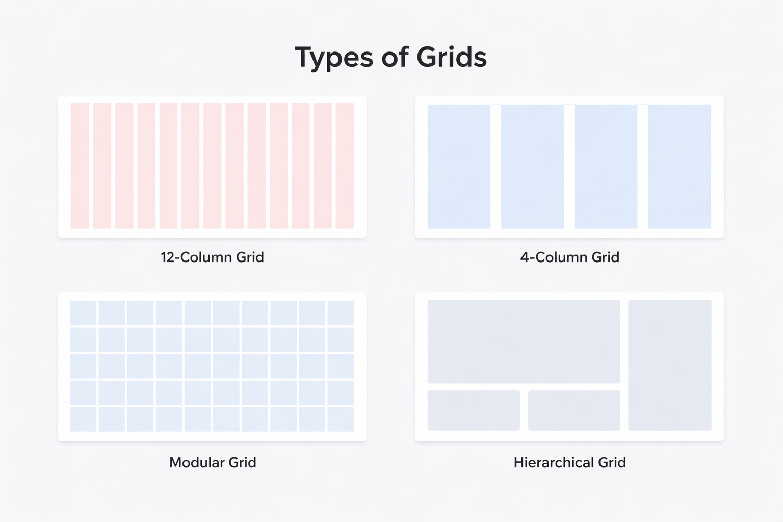
A grid is a layout structure that divides a canvas into consistent columns and rows to help align and organize content. Grids act as invisible guides (columns and rows) to align text, images, and other content, making layouts balanced, readable, and responsive across different screen sizes, ultimately creating a better user experience. Grids don’t decide what your design looks like — they decide where things should live. In simple terms:Grids help you place things consistently across a layout.
Why this matters
Grids become useful when layouts start to feel hard to manage. As screens get wider and content increases, aligning elements manually becomes fragile. Small changes start to cause misalignment, uneven spacing, and inconsistent widths. Grids provide a shared structure that:- Defines where content can live
- Keeps sections aligned as layouts grow
- Makes it easier to add, remove, or resize elements without breaking the layout
Use Cases
- Page layouts
- Dashboards
- E-commerce sites
- Multi-column content e.g cards
How to set up a grid:
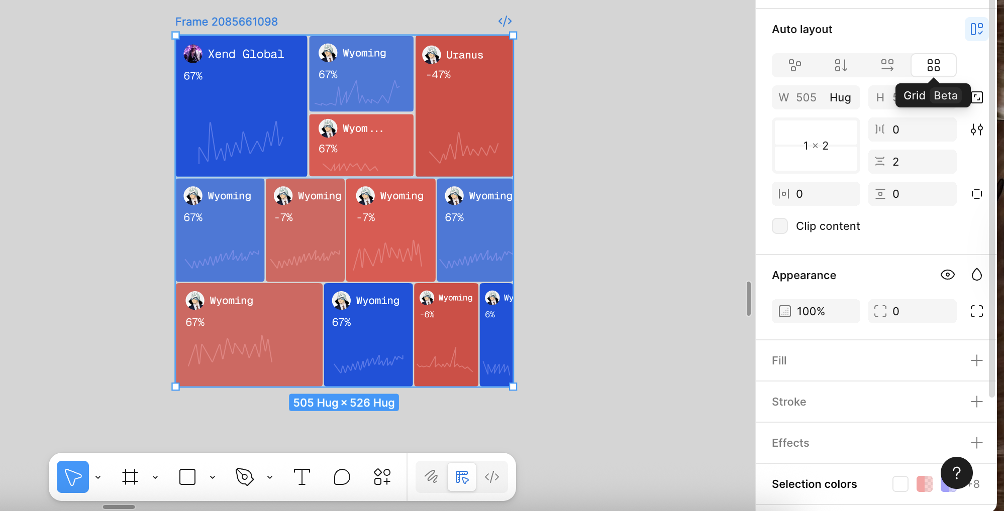
 Figma
Figma Framer
%22%2F%3E%3C%2Fmask%3E%3Cg%20mask%3D%22url(%23mask0_572_319)%22%3E%3Cg%20filter%3D%22url(%23filter0_f_572_319)%22%3E%3Cellipse%20cx%3D%2252.7381%22%20cy%3D%2265.1011%22%20rx%3D%2281.3729%22%20ry%3D%2281.1923%22%20fill%3D%22%234B73FF%22%2F%3E%3C%2Fg%3E%3Cg%20filter%3D%22url(%23filter1_f_572_319)%22%3E%3Cellipse%20cx%3D%2261.6734%22%20cy%3D%2220.547%22%20rx%3D%22104.216%22%20ry%3D%2281.1923%22%20fill%3D%22%23FF66F4%22%2F%3E%3C%2Fg%3E%3Cg%20filter%3D%22url(%23filter2_f_572_319)%22%3E%3Cellipse%20cx%3D%2278.6659%22%20cy%3D%225.26802%22%20rx%3D%2281.3729%22%20ry%3D%2271.3042%22%20fill%3D%22%23FF0105%22%2F%3E%3C%2Fg%3E%3Cg%20filter%3D%22url(%23filter3_f_572_319)%22%3E%3Cellipse%20cx%3D%2263.121%22%20cy%3D%2220.5275%22%20rx%3D%2248.9374%22%20ry%3D%2248.8288%22%20fill%3D%22%23FE7B02%22%2F%3E%3C%2Fg%3E%3C%2Fg%3E%3Cdefs%3E%3Cfilter%20id%3D%22filter0_f_572_319%22%20x%3D%22-65.0219%22%20y%3D%22-52.4784%22%20width%3D%22235.52%22%20height%3D%22235.159%22%20filterUnits%3D%22userSpaceOnUse%22%20color-interpolation-filters%3D%22sRGB%22%3E%3CfeFlood%20flood-opacity%3D%220%22%20result%3D%22BackgroundImageFix%22%2F%3E%3CfeBlend%20mode%3D%22normal%22%20in%3D%22SourceGraphic%22%20in2%3D%22BackgroundImageFix%22%20result%3D%22shape%22%2F%3E%3CfeGaussianBlur%20stdDeviation%3D%2218.1936%22%20result%3D%22effect1_foregroundBlur_572_319%22%2F%3E%3C%2Ffilter%3E%3Cfilter%20id%3D%22filter1_f_572_319%22%20x%3D%22-78.9301%22%20y%3D%22-97.0324%22%20width%3D%22281.208%22%20height%3D%22235.159%22%20filterUnits%3D%22userSpaceOnUse%22%20color-interpolation-filters%3D%22sRGB%22%3E%3CfeFlood%20flood-opacity%3D%220%22%20result%3D%22BackgroundImageFix%22%2F%3E%3CfeBlend%20mode%3D%22normal%22%20in%3D%22SourceGraphic%22%20in2%3D%22BackgroundImageFix%22%20result%3D%22shape%22%2F%3E%3CfeGaussianBlur%20stdDeviation%3D%2218.1936%22%20result%3D%22effect1_foregroundBlur_572_319%22%2F%3E%3C%2Ffilter%3E%3Cfilter%20id%3D%22filter2_f_572_319%22%20x%3D%22-39.0942%22%20y%3D%22-102.423%22%20width%3D%22235.52%22%20height%3D%22215.383%22%20filterUnits%3D%22userSpaceOnUse%22%20color-interpolation-filters%3D%22sRGB%22%3E%3CfeFlood%20flood-opacity%3D%220%22%20result%3D%22BackgroundImageFix%22%2F%3E%3CfeBlend%20mode%3D%22normal%22%20in%3D%22SourceGraphic%22%20in2%3D%22BackgroundImageFix%22%20result%3D%22shape%22%2F%3E%3CfeGaussianBlur%20stdDeviation%3D%2218.1936%22%20result%3D%22effect1_foregroundBlur_572_319%22%2F%3E%3C%2Ffilter%3E%3Cfilter%20id%3D%22filter3_f_572_319%22%20x%3D%22-22.2036%22%20y%3D%22-64.6884%22%20width%3D%22170.649%22%20height%3D%22170.432%22%20filterUnits%3D%22userSpaceOnUse%22%20color-interpolation-filters%3D%22sRGB%22%3E%3CfeFlood%20flood-opacity%3D%220%22%20result%3D%22BackgroundImageFix%22%2F%3E%3CfeBlend%20mode%3D%22normal%22%20in%3D%22SourceGraphic%22%20in2%3D%22BackgroundImageFix%22%20result%3D%22shape%22%2F%3E%3CfeGaussianBlur%20stdDeviation%3D%2218.1936%22%20result%3D%22effect1_foregroundBlur_572_319%22%2F%3E%3C%2Ffilter%3E%3ClinearGradient%20id%3D%22paint0_linear_572_319%22%20x1%3D%2240.4527%22%20y1%3D%2221.4331%22%20x2%3D%2276.9327%22%20y2%3D%22121.971%22%20gradientUnits%3D%22userSpaceOnUse%22%3E%3Cstop%20offset%3D%220.025%22%20stop-color%3D%22%23FF8E63%22%2F%3E%3Cstop%20offset%3D%220.56%22%20stop-color%3D%22%23FF7EB0%22%2F%3E%3Cstop%20offset%3D%220.95%22%20stop-color%3D%22%234B73FF%22%2F%3E%3C%2FlinearGradient%3E%3C%2Fdefs%3E%3C%2Fsvg%3E) Lovable
Lovable
1
Select a Frame
Select a Frame with the target elements
2
Add Grid
In the right panel, scroll to Layout, and select Grid
3
Grid Type
Choose a Grid type, either rows or column, and customize accordingly.

Common mistakes across tools
- Treating grids as visible design elements
- Over-constraining layouts to the grid
- Ignoring content when choosing column counts
- Using grids where simpler layouts would work better