What this means
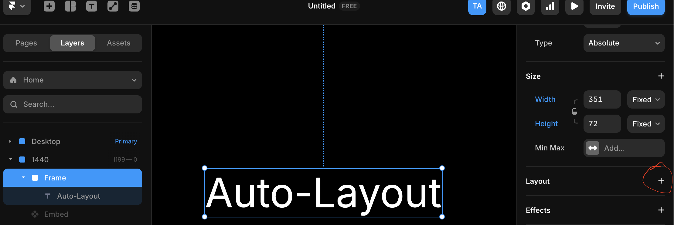
Auto Layout is a way to automatically arrange and size elements based on rules instead of fixed positions. Instead of manually adjusting width, height, and spacing every time content changes, Auto Layout lets the layout respond to:- Content size
- Spacing rules
- Direction (horizontal or vertical)
Auto Layout lets your design adapt instead of breaking.
Why this matters
Without Auto Layout:- Buttons break when text changes
- Cards stop scaling when content grows
- Designs feel “fixed” instead of flexible
- Components resize automatically
- Spacing stays consistent
- Designs translate better to code
- Responsiveness becomes easier
- Buttons
- Cards
- Lists
- Navbars
- Reusable components
 Figma
Figma Framer
%22%2F%3E%3C%2Fmask%3E%3Cg%20mask%3D%22url(%23mask0_572_319)%22%3E%3Cg%20filter%3D%22url(%23filter0_f_572_319)%22%3E%3Cellipse%20cx%3D%2252.7381%22%20cy%3D%2265.1011%22%20rx%3D%2281.3729%22%20ry%3D%2281.1923%22%20fill%3D%22%234B73FF%22%2F%3E%3C%2Fg%3E%3Cg%20filter%3D%22url(%23filter1_f_572_319)%22%3E%3Cellipse%20cx%3D%2261.6734%22%20cy%3D%2220.547%22%20rx%3D%22104.216%22%20ry%3D%2281.1923%22%20fill%3D%22%23FF66F4%22%2F%3E%3C%2Fg%3E%3Cg%20filter%3D%22url(%23filter2_f_572_319)%22%3E%3Cellipse%20cx%3D%2278.6659%22%20cy%3D%225.26802%22%20rx%3D%2281.3729%22%20ry%3D%2271.3042%22%20fill%3D%22%23FF0105%22%2F%3E%3C%2Fg%3E%3Cg%20filter%3D%22url(%23filter3_f_572_319)%22%3E%3Cellipse%20cx%3D%2263.121%22%20cy%3D%2220.5275%22%20rx%3D%2248.9374%22%20ry%3D%2248.8288%22%20fill%3D%22%23FE7B02%22%2F%3E%3C%2Fg%3E%3C%2Fg%3E%3Cdefs%3E%3Cfilter%20id%3D%22filter0_f_572_319%22%20x%3D%22-65.0219%22%20y%3D%22-52.4784%22%20width%3D%22235.52%22%20height%3D%22235.159%22%20filterUnits%3D%22userSpaceOnUse%22%20color-interpolation-filters%3D%22sRGB%22%3E%3CfeFlood%20flood-opacity%3D%220%22%20result%3D%22BackgroundImageFix%22%2F%3E%3CfeBlend%20mode%3D%22normal%22%20in%3D%22SourceGraphic%22%20in2%3D%22BackgroundImageFix%22%20result%3D%22shape%22%2F%3E%3CfeGaussianBlur%20stdDeviation%3D%2218.1936%22%20result%3D%22effect1_foregroundBlur_572_319%22%2F%3E%3C%2Ffilter%3E%3Cfilter%20id%3D%22filter1_f_572_319%22%20x%3D%22-78.9301%22%20y%3D%22-97.0324%22%20width%3D%22281.208%22%20height%3D%22235.159%22%20filterUnits%3D%22userSpaceOnUse%22%20color-interpolation-filters%3D%22sRGB%22%3E%3CfeFlood%20flood-opacity%3D%220%22%20result%3D%22BackgroundImageFix%22%2F%3E%3CfeBlend%20mode%3D%22normal%22%20in%3D%22SourceGraphic%22%20in2%3D%22BackgroundImageFix%22%20result%3D%22shape%22%2F%3E%3CfeGaussianBlur%20stdDeviation%3D%2218.1936%22%20result%3D%22effect1_foregroundBlur_572_319%22%2F%3E%3C%2Ffilter%3E%3Cfilter%20id%3D%22filter2_f_572_319%22%20x%3D%22-39.0942%22%20y%3D%22-102.423%22%20width%3D%22235.52%22%20height%3D%22215.383%22%20filterUnits%3D%22userSpaceOnUse%22%20color-interpolation-filters%3D%22sRGB%22%3E%3CfeFlood%20flood-opacity%3D%220%22%20result%3D%22BackgroundImageFix%22%2F%3E%3CfeBlend%20mode%3D%22normal%22%20in%3D%22SourceGraphic%22%20in2%3D%22BackgroundImageFix%22%20result%3D%22shape%22%2F%3E%3CfeGaussianBlur%20stdDeviation%3D%2218.1936%22%20result%3D%22effect1_foregroundBlur_572_319%22%2F%3E%3C%2Ffilter%3E%3Cfilter%20id%3D%22filter3_f_572_319%22%20x%3D%22-22.2036%22%20y%3D%22-64.6884%22%20width%3D%22170.649%22%20height%3D%22170.432%22%20filterUnits%3D%22userSpaceOnUse%22%20color-interpolation-filters%3D%22sRGB%22%3E%3CfeFlood%20flood-opacity%3D%220%22%20result%3D%22BackgroundImageFix%22%2F%3E%3CfeBlend%20mode%3D%22normal%22%20in%3D%22SourceGraphic%22%20in2%3D%22BackgroundImageFix%22%20result%3D%22shape%22%2F%3E%3CfeGaussianBlur%20stdDeviation%3D%2218.1936%22%20result%3D%22effect1_foregroundBlur_572_319%22%2F%3E%3C%2Ffilter%3E%3ClinearGradient%20id%3D%22paint0_linear_572_319%22%20x1%3D%2240.4527%22%20y1%3D%2221.4331%22%20x2%3D%2276.9327%22%20y2%3D%22121.971%22%20gradientUnits%3D%22userSpaceOnUse%22%3E%3Cstop%20offset%3D%220.025%22%20stop-color%3D%22%23FF8E63%22%2F%3E%3Cstop%20offset%3D%220.56%22%20stop-color%3D%22%23FF7EB0%22%2F%3E%3Cstop%20offset%3D%220.95%22%20stop-color%3D%22%234B73FF%22%2F%3E%3C%2FlinearGradient%3E%3C%2Fdefs%3E%3C%2Fsvg%3E) Lovable
Lovable
1
Select 1 or more layers
Select a layer or element to give Auto-Layout
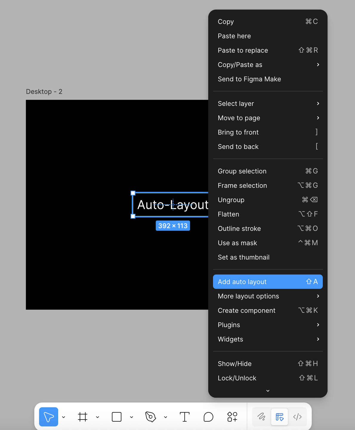
2
Give Auto-Layout
Press Shift + A or right click and select Auto Layout
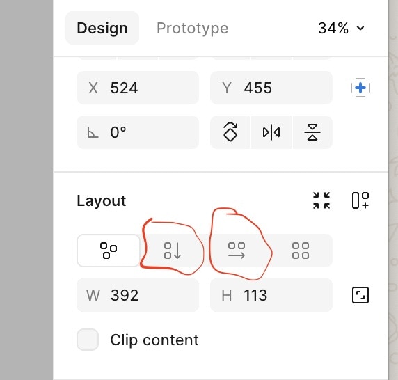
3
Choose Direction
In the layout section of the right panel, Choose a direction:
- Horizontal → items flow side by side
- Vertical → items stack top to bottom
Common Use Cases
- Auto-resizing buttons
- Cards that grow with content
- Navigation bars
- Content sections that adapt across screens
- Lists with consistent spacing
Common mistakes across tools
- Using fixed widths when content should drive size
- Mixing fixed and flexible sizing randomly
- Using Auto Layout too late instead of from the start