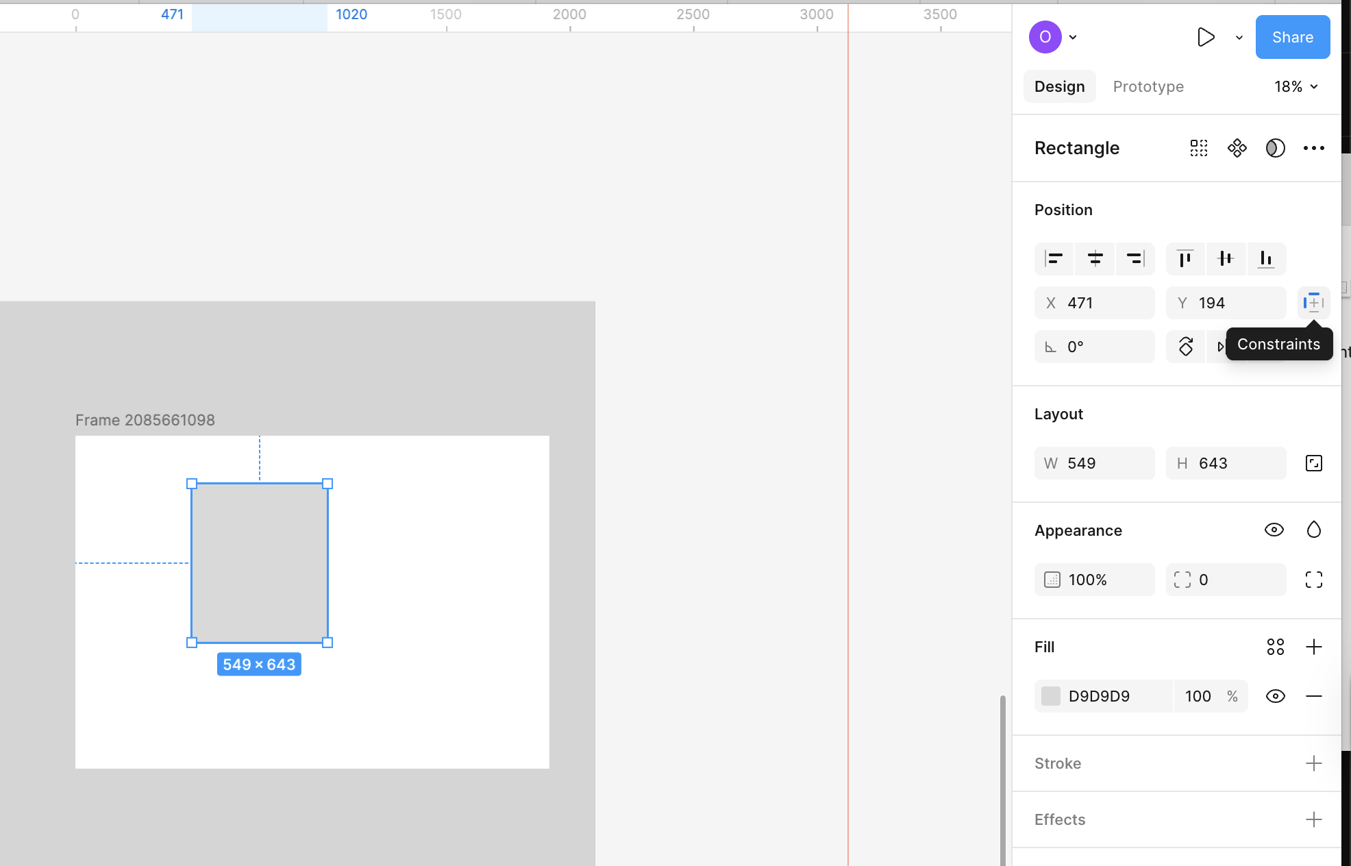
What this means
Constraints define how elements behave when their container changes size. Instead of fixing an element to a specific position, constraints let you specify:- Which edges an element is attached to
- Whether it resizes or stays fixed
- How it responds when the screen grows or shrinks
 Figma
Figma Framer
%22%2F%3E%3C%2Fmask%3E%3Cg%20mask%3D%22url(%23mask0_572_319)%22%3E%3Cg%20filter%3D%22url(%23filter0_f_572_319)%22%3E%3Cellipse%20cx%3D%2252.7381%22%20cy%3D%2265.1011%22%20rx%3D%2281.3729%22%20ry%3D%2281.1923%22%20fill%3D%22%234B73FF%22%2F%3E%3C%2Fg%3E%3Cg%20filter%3D%22url(%23filter1_f_572_319)%22%3E%3Cellipse%20cx%3D%2261.6734%22%20cy%3D%2220.547%22%20rx%3D%22104.216%22%20ry%3D%2281.1923%22%20fill%3D%22%23FF66F4%22%2F%3E%3C%2Fg%3E%3Cg%20filter%3D%22url(%23filter2_f_572_319)%22%3E%3Cellipse%20cx%3D%2278.6659%22%20cy%3D%225.26802%22%20rx%3D%2281.3729%22%20ry%3D%2271.3042%22%20fill%3D%22%23FF0105%22%2F%3E%3C%2Fg%3E%3Cg%20filter%3D%22url(%23filter3_f_572_319)%22%3E%3Cellipse%20cx%3D%2263.121%22%20cy%3D%2220.5275%22%20rx%3D%2248.9374%22%20ry%3D%2248.8288%22%20fill%3D%22%23FE7B02%22%2F%3E%3C%2Fg%3E%3C%2Fg%3E%3Cdefs%3E%3Cfilter%20id%3D%22filter0_f_572_319%22%20x%3D%22-65.0219%22%20y%3D%22-52.4784%22%20width%3D%22235.52%22%20height%3D%22235.159%22%20filterUnits%3D%22userSpaceOnUse%22%20color-interpolation-filters%3D%22sRGB%22%3E%3CfeFlood%20flood-opacity%3D%220%22%20result%3D%22BackgroundImageFix%22%2F%3E%3CfeBlend%20mode%3D%22normal%22%20in%3D%22SourceGraphic%22%20in2%3D%22BackgroundImageFix%22%20result%3D%22shape%22%2F%3E%3CfeGaussianBlur%20stdDeviation%3D%2218.1936%22%20result%3D%22effect1_foregroundBlur_572_319%22%2F%3E%3C%2Ffilter%3E%3Cfilter%20id%3D%22filter1_f_572_319%22%20x%3D%22-78.9301%22%20y%3D%22-97.0324%22%20width%3D%22281.208%22%20height%3D%22235.159%22%20filterUnits%3D%22userSpaceOnUse%22%20color-interpolation-filters%3D%22sRGB%22%3E%3CfeFlood%20flood-opacity%3D%220%22%20result%3D%22BackgroundImageFix%22%2F%3E%3CfeBlend%20mode%3D%22normal%22%20in%3D%22SourceGraphic%22%20in2%3D%22BackgroundImageFix%22%20result%3D%22shape%22%2F%3E%3CfeGaussianBlur%20stdDeviation%3D%2218.1936%22%20result%3D%22effect1_foregroundBlur_572_319%22%2F%3E%3C%2Ffilter%3E%3Cfilter%20id%3D%22filter2_f_572_319%22%20x%3D%22-39.0942%22%20y%3D%22-102.423%22%20width%3D%22235.52%22%20height%3D%22215.383%22%20filterUnits%3D%22userSpaceOnUse%22%20color-interpolation-filters%3D%22sRGB%22%3E%3CfeFlood%20flood-opacity%3D%220%22%20result%3D%22BackgroundImageFix%22%2F%3E%3CfeBlend%20mode%3D%22normal%22%20in%3D%22SourceGraphic%22%20in2%3D%22BackgroundImageFix%22%20result%3D%22shape%22%2F%3E%3CfeGaussianBlur%20stdDeviation%3D%2218.1936%22%20result%3D%22effect1_foregroundBlur_572_319%22%2F%3E%3C%2Ffilter%3E%3Cfilter%20id%3D%22filter3_f_572_319%22%20x%3D%22-22.2036%22%20y%3D%22-64.6884%22%20width%3D%22170.649%22%20height%3D%22170.432%22%20filterUnits%3D%22userSpaceOnUse%22%20color-interpolation-filters%3D%22sRGB%22%3E%3CfeFlood%20flood-opacity%3D%220%22%20result%3D%22BackgroundImageFix%22%2F%3E%3CfeBlend%20mode%3D%22normal%22%20in%3D%22SourceGraphic%22%20in2%3D%22BackgroundImageFix%22%20result%3D%22shape%22%2F%3E%3CfeGaussianBlur%20stdDeviation%3D%2218.1936%22%20result%3D%22effect1_foregroundBlur_572_319%22%2F%3E%3C%2Ffilter%3E%3ClinearGradient%20id%3D%22paint0_linear_572_319%22%20x1%3D%2240.4527%22%20y1%3D%2221.4331%22%20x2%3D%2276.9327%22%20y2%3D%22121.971%22%20gradientUnits%3D%22userSpaceOnUse%22%3E%3Cstop%20offset%3D%220.025%22%20stop-color%3D%22%23FF8E63%22%2F%3E%3Cstop%20offset%3D%220.56%22%20stop-color%3D%22%23FF7EB0%22%2F%3E%3Cstop%20offset%3D%220.95%22%20stop-color%3D%22%234B73FF%22%2F%3E%3C%2FlinearGradient%3E%3C%2Fdefs%3E%3C%2Fsvg%3E) Lovable
Lovable
1
Select an element inside a frame
Constraints only apply to elements that live inside a parent container.
2
Set horizontal and vertical constraints
In the right panel, choose rules such as:
- Left, Right, Center
- Top, Bottom, Center
- Scale for resizing behavior
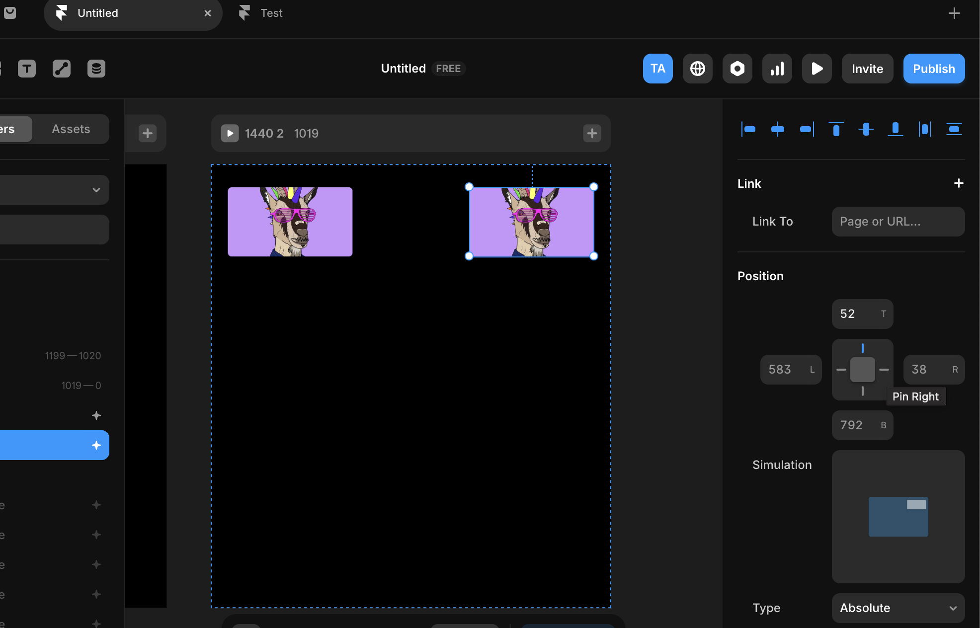
3
Resize the frame to test behavior
Resize the parent frame and observe how the element responds, and adjust constraints until the behavior matches your intent.
Why this matters
Constraints become important once layouts stop being static. As soon as designs need to:- Adapt to different screen sizes
- Handle dynamic content
- Be handed off for implementation